Wednesday, 27 June 2012

Project Areas of illustration part 3

Exercise : A tattoo


This time I have to design a tattoo for a friend that is based on the word Mum.  Than I have to design a greeting card for his mum.

reaserch


I found a few images that represent a female tattoo.  Some of them are simply and some of them are more complicated in terms of colours and design.


a


                                                                                                                    b

c
d


e


My tattoo will be based on the shape of the swan that represents motherhood to me.

I would like to make it as smooth in shapes as I can.  I found a few pictures of the swans with the chicks.

a


                                                           b


c
                                                                                                                 d


I would like to make it as smooth in shapes as I can.  I found a few pictures of the swans with the chicks.


                                               stage 1

                                              stage 2

                                          
                                           stage 3


  I am very happy at this stage of my work.  I am on good way to keep it as simple as I can.  I need to remember that this is a tattoo not a painting therefore, it should not contain too many details.  I went on one website that says how to make a good tattoo and how to design. According to that website, it should have only a few simple colours and a very simple shape.


This is my tattoo.  I managed to keep it very simple and I used a bright pink colour in the middle of black heart.  Why did I use a pink colour?  I made a decision based on the current subject.  Motherhood reminds me of a very warm feeling therefore the colour should be a bright and warm.


Project Areas of illustration part 2

Exercise : A menu card


For this task you are asked to provide an illustration for use on the menu of a sophisticated , quality fish restaurant- one in a chain sited in major European cities.The menu uses a fresh ingredients.


I was quite lucky as that day I bought a nice fresh fish from the counter.  I baked this mackerel in the oven; put some nice, fresh looking garnish on the plate and voila!  I had a perfect looking modern supper.

    a        b


My next step was to make a drawing on a white background with a black ink.  When my sketch was ready, I decided to work on it with a computer program.  I knew that my illustration was going to look very fresh because of green round peas and yellow slice of lemon.


As a background of my illustration, I placed an old menu that says how to prepare a beer batter fish.  I really like the look of that old font, in my opinion it looks modern and yet so stylish.

                                                           finished illustration


Tuesday, 26 June 2012


I discovered this illustrator a few days ago when I was in Poland.  Ola Cieslak is the illustrator and I found her artwork very quirky and sweet.  The painting by Albrecht Durer called “Young Hare “was the inspiration for this little book.  

 I would like to follow this style in the future.


Project Areas of illustration part 1

Exercise : A children's book cover

You are asked to produce a cover illustration for a natural history book for children ( age 7-11 ) entitled " Animals from Around the World ".

reaserch


I went to the library yesterday to do a research.  I found out that many books have a picture of the animals on the front page. I think it is the easiest way of making a book cover for children.  I did not want to go this path therefore I managed to find only a few different ones with the drawings. These books are not my favourite ones but they still look different from just a picture of the animals.


spider diagram


This is my spider diagram for this exercise.  I had some difficulties with finding different ideas for this exercise therefore my spider diagram looks very simple.


ideas

I came up with three ideas while I was sitting in the coffee shop.  The first illustration could have a palm tree built with different animals patterns.

The two next ones could have a tiger or an elephant as a main subject of the cover.  


This is a mood board with a different animals skin patterns.

I managed to play with this board in Photoshop program to achieve an interesting effect.


a


                       b                                                                                                                                     c


first stage of the book cover


I transformed this image into the sketch just like the old books they use to look like.  I kept the colours, as close to the naturals as I could however, I did not like the result.  My cousin said to me that it looks to sad and may not appeal to the younger audience.  After his comment, I decided to make another one.  This time I knew that I should make this book cover more fun and interesting for kids.


another day and another  idea....


I wanted to have a circus or a theatre stage, very colourful with a big red curtain.

I copied a picture of a theatre stage and after that; I started to change the colours.

stage 1


stage 2


So far so good.  I like the effect at this stage.  I am happy with the wooden tablemat, which I scanned and transformed in the computer program.  I am happy with the colours and the depth on the stage.  I have to remember that this is just a background for the animals therefore; it has to be less visible.

stage 3


Next step is to make the animals pictures, as they were puppets in the theatre.  I placed a few pictures on the white background to make them more visible. Later I will place all my animals on the wooden sticks.

stage 4


stage 5


I finished my book cover.  I think that it looks very interesting and stylish.  I hope that the kids in age between 7and 11 would choose this book from the library shelf.


Monday, 2 April 2012

Assignment three

A poster

I was so excited when I heard about this project. So many famous names come to my head with the word  " Jazz"  music like  Louis Armstrong, Billie Holiday or Ella Fitzgerald.  I made the decision about " Jazz night poster" as this music takes a place very close to my heart. I grow up listening to this music and I have to say that I am very familiar with polish jazz. This music was very important in my country in late 60 and 70 as it was the music of underground if I may say like that. Young artists could express their political opinion or frustration by playing this music. Obviously I cannot remember anything from that time but this music is still young and fresh in polish jazz clubs.

This poster made by Gunter Kieser  is a good example of  German Art between  1955-1960.  It is very simple in colours, lines and shapes.

Gunter Kieser

" Samba D'Orpheus" by Johanna Kriesel looks like most American jazz posters from middle of the 20th century. The colours are simple, there is a shape of a musician playing on the jazz instrument. I like the dark colours  of the background as they give a warm temperature to this poster. The orange round shape reminds me of a Sunset , the time of the day when the jazz is the most popular.

" Samba D'Orpheus" by Johanna Kriesel

 I put a poster by Marco Fabiano to give an example of female jazz singer. the colours are calm and sensual however very warm.  

Marco Fabiano


Roland Crump " Pete's Poop Deck Jazz Club" 1960


Tomaszewski for Jazz Jamboree 1971


This is my brainstorm and moodboard

 My moodboard tells about the atmosphere around that kind of music. There is a bit of quirky smile of L. Armstrong and the sound of his trumpet, there is also a bit of  alcohol to give a loose mood in the evening. New York is a capital of jazz music therefore I had to mention that. Leszek Mozdzer is my favourite polish jazz musician of my generation so I knew that his name is going to be as a part of my moodboard.  


07.03.2012


My first illustration for this project has been inspired by Leszek Mozdzer music, very young and vibrant. I wanted to combine this colourful music and I gave bit more movement by drawing a  shouting person. The lines made with black ink shoves also an expressive nature of jazz.


I changed my illustration just a little bit by using blue colours to express an evening nature of this event. I have also changed my colourful headdress into a piano keyboard .


I added some music notes to complement the background and I have also put the jazz trumpet in the left bottom corner . I thought that the perfect place to put the information about this event was the top right part of the paper. The pink colour is so visible to the eye but not too shouting.
 I think that the part where the pencil is still visible makes this poster still fresh and vibrant.


 I took my next idea from this poster


originally that was a photo which I took one day in London. I saw one man playing on the piano in the middle of the street .

I put this photo in to the computer program and worked a while to the vibrant colours. I added the trumpet to make this poster in a jazz style.

This is more like the poster above made by a professional illustrator. I thought that I could make my poster simpler so I cut everything around the musician. I used a scanned brown paper for the background and deliberately I kept only warm colours just like on the poster above. But there was something that I did not like overall. I decided to keep working on this project......

I kept working......


...... and working  again.....

This is nearly my completed poster . I like it overall but there is something which  makes me think that this is not a fully my art work. Just the fact that I used a photo from my personal album left me in this mood like I was partly cheating.  


01.04.2012


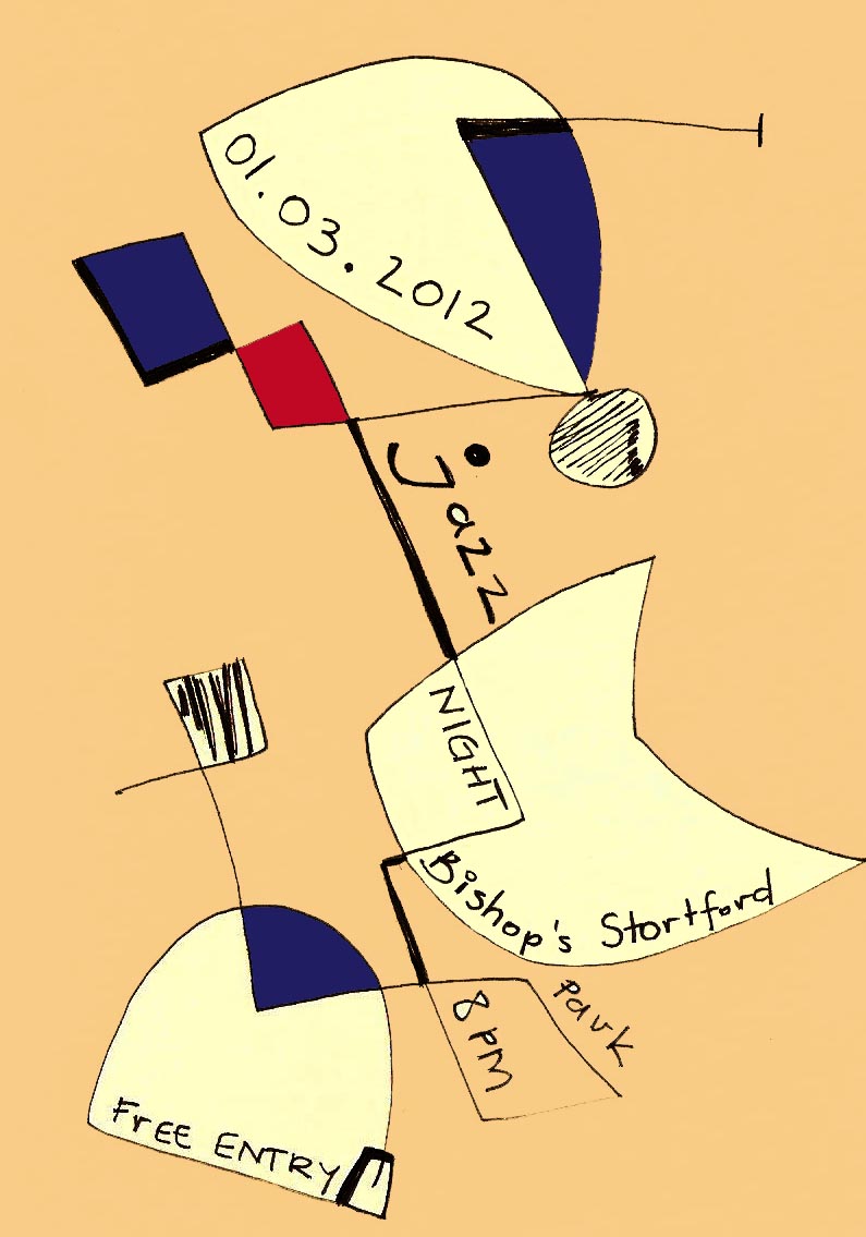
I was about to send my assignment to my tutor this morning, however it did not happen as I got my another idea from a poster while I was looking at the beginning of my blog. My attention was caught by the poster made by Gunter Kieser


I took a small blank card and draw a quick sketch with a black pen.


After a few hours  working in Photoshop to make this sketch to look like a poster I came to this finished illustration.
I know that this is my final work from which I am content and glad. It has got everything that I was looking for previously in my projects. It has got a simple lines that make an interesting shapes. This poster has bold colours but they catch the eye and attention. I am very pleased with the composition as it is not steady and calm, this composition moves like jazz music.