Tuesday, 7 February 2012

Project - Hierarchy in the image

Exercise: Reading an image


1)   What the image is about.What is it saying?

In this image, two boys try to steal something from the cave where the dragon is sleeping.

2)  Work out the narrative and identify the story

We are looking at these two boys and the dragon from the illustrator’s point of view therefore this is narration in the third person.  It means that the narrator does not belong to the world, which is described in this illustration.  It looks like the story is about two boys who think that they can steal something from the dragon using only bare hands.  One of them is pointing at the outside world and is trying to get out before it is too late.  The other one looks more determined and wants to take something that belongs to the beast.  We can see that they are not the first who wanted to possess something from this cave.

3)  Describe the palette and tonal range which has been used. Note if the colours are hot or cold, whether the elements are detailed or textural, and where these approaches are used.


There are hot and cold colours.  There is a wide palette of colours and the tonal range is vivid and vibrant. There is a good notification of texture especially on the dragon skin and the cave.  It works very well as an illustration.

4)  Is there any connection between hot colour and the importance of the element in telling the story?


There is a big connection between hot colours in this image as it builds a mood and brings the elements to the front of the illustration.

Part three-project : Composition and viewpoint

Exercise : Illustrating visual space

                                                composition nr.1


                                           composition nr. 2


                                          composition nr.3


                                          composition nr.4


                                         composition nr.5

                                          composition nr.6


                                         composition nr.7
                     

  • How does your sense of the image and its meaning change when the figure is smaller than the other elements?
Composition nr.  one, two, five and seven  is a good example of it.  The figure of running girl is smaller than the rest. On the composition nr. one there is a bigger distance between the girl and the house.  The composition nr. two makes a different impression where the distance between the  girl and the house is not as that big as between the viewer.  The composition nr. seven gives a sense of the space as the girl is smaller than the tree but the tree is bigger than the house standing so far away.
  • If the elements are at differing angles to each other and at the frame, what dynamic is suggested?

 I could not to find information how to describe the dynamic in professional way; however, it looks to me that the composition nr.  three, four and six shove a big dynamic as the objects are moving and they have different angel to each other.
  • If all the elements are completly horizontal and vertical in relation to the frame what dynamic is suggested? What is your opinion about this image and what sensation does it communicate?

    Composition nr.  one, two, five and seven look clam and correct if I can describe in this way.  However, they may look quite boring and predictable if we compare the composition with the rest. There is still a dynamic of objects but it does not look as interesting as the composition nr.  three.

 
  • Which is your favourite composition? Explain why you feel it is most succesful.

My favourite composition is nr.  four and the reason for this is the house in the top left corner.  The little girl looks like she is running in this direction completely breaking the rules of gravity. There is a good dynamic and the horizontal line makes it even more interesting to my eye.

Monday, 16 January 2012

Assignment two

I have been asked to create an illustration of fruit or vegetables. One illustration for each of the ranges :   Summer   and  Autumn .

My images should be objective and based upon direct observation.

Then I have to create separate images for Summer and Autumn to describe the season itself.

I did a few sketches of summer and autumn fruits unfortunately there are not as that much of autumn fruits which grow in U.K


Autumn project


18.01.2012

 I completely forgot about a cook book that I have at home"Family meals for a fiver!", where I found a list of Summer and Autumn fruits .
 
 I did another research on Internet looking for some images about Summer and Autumn fruits.Than I took my sketchbook where I did a few quick simple drawings with a colour samples.


red/pink


blue/purple/brown


red
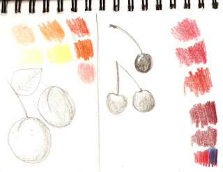


yellow/orange/red/


green/yellow/blue


red/pink/orange/peach


brown/green/yellow/red/pink

pink/blue/burgundy
I have also found some of my old sketches that I did when I went to a fruits farm last Summer:


This is my Autumn image created just a few seconds ago


 Summer


Now it is time for me go to my small art studio and create a good piece of Summer  fruits illustration.

I went to the supermarket to do a research yesterday.  I found out that they use only three examples of fruits for a display board. There colour of background is black which makes fruits more visible from the distance.
I decided to make some samples of compositions based on my current observation.


What I am looking for is the composition that will reflect the character of the season and the fruits.  I would like to create a vibrant image visible from the distance.  I would like to produce a high standard image that meets the expectations of my client and their customers.  I asked myself “what image would I like to see?”, so I came up with some solutions.
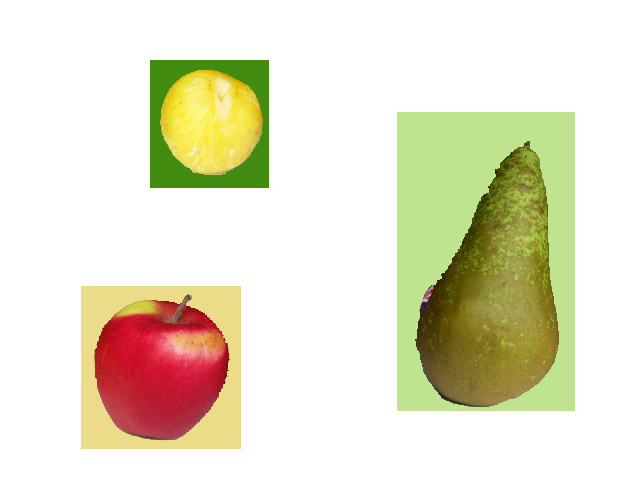
I bought summer and autumn fruits and took a photo of them, than I managed to work with them in Photoshop Elements to check how they look with different colours and which composition looks the best.

composition 1

This dynamick composition works well with dark brown background, vibrant green, orange and yellow colours.  The fruits look visible and appealing. 


                                                                  composition 2

This composition looks like one of the leading supermarkets so I definitely can not use this for my project.  However, it looks well , black background gives a nice contrast between fresh fruits.


composition 3


composition 4

composition 5


composition 6

composition 7

Composition from three to seven looks quite similar.  I have to say that the fruits disappear on the white background somehow.  I tried to use some of the summer/autumn colours in the background but I do not like the result.
23.01.2012

scan nr.1 - cherries


scan nr. 2 - yellow plums


scan nr. 3 - strawberries

          scan nr.4 - apples
       scan nr.5 - green/yellow/red pear

  scan nr.6 - yellow pears


Now when I got my initial paintings of summer and autumn fruits I can work on them in Photoshop Elements to create a final image


immage 1

                                                                 immage 2


24.01.2112


                                                                   immage 1

immage 2

immage 3

immage 4


This is my final image for Summer fruits :


                                             This is my final imafe of Autumn fruits :


I am very pleased with my last images for this assignment.  I am happy with the colours for autumn project where I decided to use only colours like browns and orange to reflect an autumn atmosphere. I did the same with summer but using colours like pink and red.